
We have written extensively on this blog and in research papers about the need for public sector pension plans to use better methods for estimating the value of the pensions benefits they have promised. Part of the challenge in improving discount rate practices is the variance in how states choose to approach reporting the value of their liabilities. Another part of the challenge is that the market value of liabilities may vary somewhat from state to state. But if state policymakers were to suddenly shift their approach towards using market valued liabilities, how would that actually change the reported amount of benefits? Or to put this more directly — how much pension debt is being hidden by the use of misguided accounting practices?
My colleague Zach Christensen puts forward an answer to this question in a new commentary and infographic that breaks down the top public sector pension plans for each state and re-discounts the value of their liabilities using a market value of liabilities. The results create a fascinating list that singles out not only poorly funded plans, but also well funded plans that are using particularly high discount rates (thus exposing that their reported health may not be as strong as intimated).
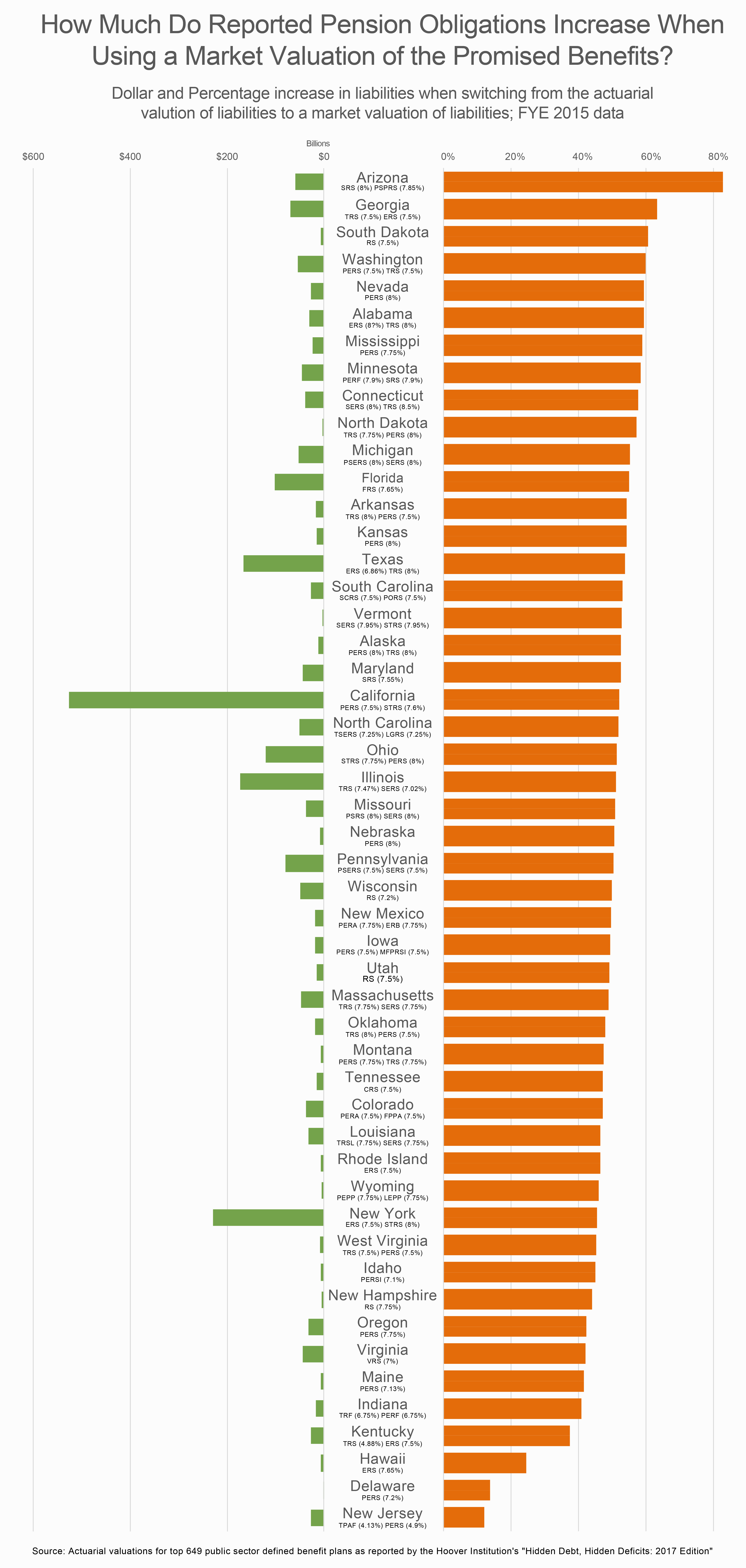
Zach ranks states by how much the estimated value of pension obligations would increase when adopting a market valuation of liabilities practice. The top 10 worst states in Zach’s list based on FY2015 numbers are:
- Arizona (83% increase)
- Georgia (63% increase)
- South Dakota (61% increase)
- Washington (60% increase)
- Nevada (59.4% increase)
- Alabama (59.3% increase)
- Mississippi (58.9% increase)
- Minnesota (58.4% increase)
- Connecticut (57.8% increase)
- North Dakota 57.1% increase)
One thing that is interesting is that this contains reportedly well funded and poorly funded plans. For example, South Dakota is typically one of the top five plans in the county, while North Dakota’s teachers and public employee plans were both less than 70% funded last year. The reason the list includes such a range of plans by funded status is that they share in common a single trait — the use of a high discount rate. The average discount rate used by the 10 best states the ranking is 6.9% while the average discount rate for the 10 worst states was 7.8%. Thus, for those on the top of this list there is just a larger delta between their current practices and the use of market discount rates.
As Zach writes:
Every state pension plan gets to decide what kind of accounting practices it wants to follow when reporting the value of its assets and size of its unfunded liability. As a result, states have adopted a range of different approaches, leading to inconsistencies in the reported amount of pension debt compared to more accurate methods of measuring the promises made to teachers, police officers, firefighters, and other public-sector workers. And it should not be a surprise that some states are using practices that significantly understate the amount of their promised pensions.
Check out the full write up here.
Check out the infographic below: