

Reports are piling up that a deal to avert the spending cuts in the so-called “fiscal cliff” is looking increasinly unlikely. But Congress has a history of finding ways to avoid hard decisions, and it is possible that legislation could be passed to delay when the fiscal cliff cuts and tax hikes kick in. Whether this option or some other 11th hour proposal, here is a graph that might help you put in context any fiscal cliff deal that is proposed over the next few days:
The quick take away from these numbers is that a “balanced approach” of equal spending cuts and revenue increases is an untenable idea. Spending is completely out of control in Washington and does not look to be slowing down.
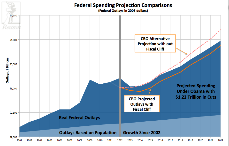
But let’s back up and walk through these numbers, starting with a baseline for what returning to fiscal responsibility would look like. Since budget experts like to talk in ten-year time spans, let’s assume that all federal spending was frozen in 2002. There was plenty of federal excess in 2002, but it is at least a target many progressives could agree on to start with, since they would still have many of their programs and war spending is winding down anyway. If Congress were to have frozen spending in 2002 at all levels of government and just increased federal outlays by the rate of population (so spending per person would remain the same), then federal spending would have just grown from $2.2 trillion to $2.27 trillion by 2012 (all dollars adjusted for inflation). This growth is represented in the light blue area at the bottom of the graph.
Now compare that to what we did spend from 2002 to 2012, a gross over extension of federal spending that has led directly to today’s fiscal crisis. It is true that the federal deficit is larger today because the recession weakened economy meant lower tax returns, however federal spending only increased more in 2008 and has remained excessively high above the growth rate we could have expected by just keeping federal programs at 2002 levels. This is shown in the dark blue area on the graph.
Enter the fiscal cliff debate.
The really scary part of this chart is the projections for the future. The dark blue shading on the second half of the graph represents what federal spending would look like under President Obama’s proposed alternative to the fiscal cliff spending cuts. On December 17, the president suggested replacing the cuts scheduled to start on January 1 that were the trade off for allowing the debt ceiling to increase last summer with $1.22 trillion in other “cuts”-cuts that count savings from using a different measure of inflation for Social Security costs and projected reductions in interest payments on the national debt, along with much lower defense spending savings. You can see federal spending continues to grow out of control under this proposal.
If Congress were to do nothing and we go “over the fiscal cliff” then the solid yellow line represents the direction of federal spending over the next 10-years-still a dramatic swing upward not that much different from President Obama’s proposed alternative.
If Congress were to delay all of the spending cuts and extend the current tax rates for everyone (what the Congressional Budget Office calls the “alternative fiscal scenario”) then the dotted- line would be the projected direction for federal spending. This is perhaps the worst option for reigning in federal spending.
Simply put, Washington has a serious spending problem. A spending problem with our money. And as Nick Gillespie and Veronique de Rugy pointed out last week-none of the options on the table right now come anywhere close to moving towards real fiscal responsibility. Whatever ideas are floated this week to avert the so-called “fiscal cliff,” it is worth keeping the above graph in mind and comparing them to what has been proposed before.